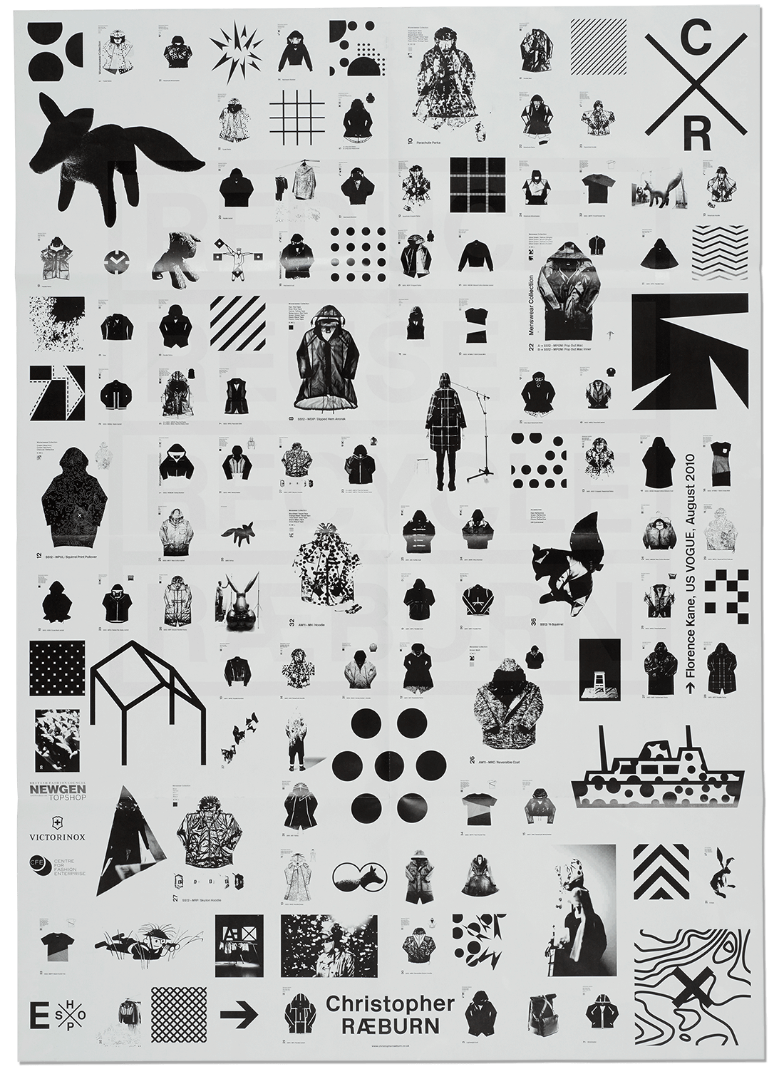
RÆBURN
Visual identity
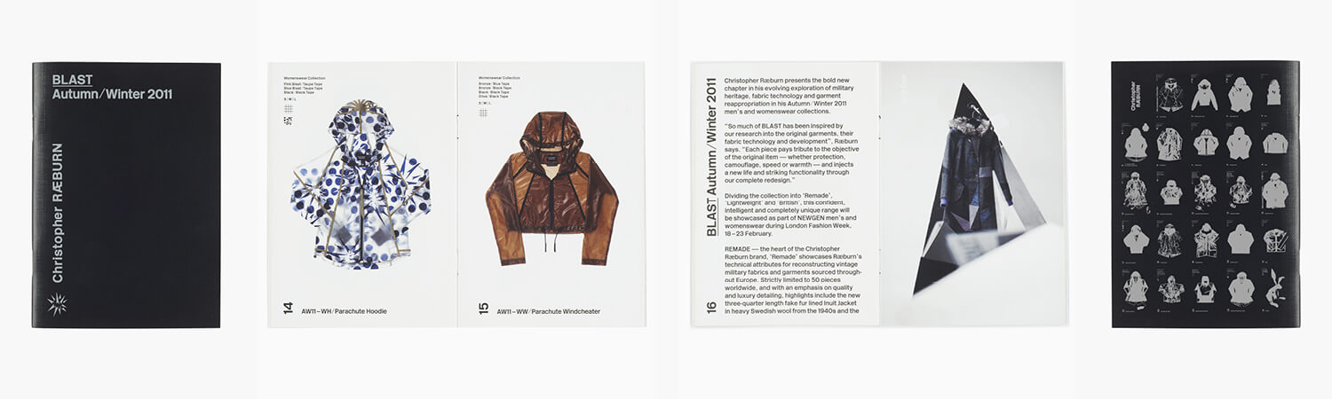
Art direction and graphic design since 2009.
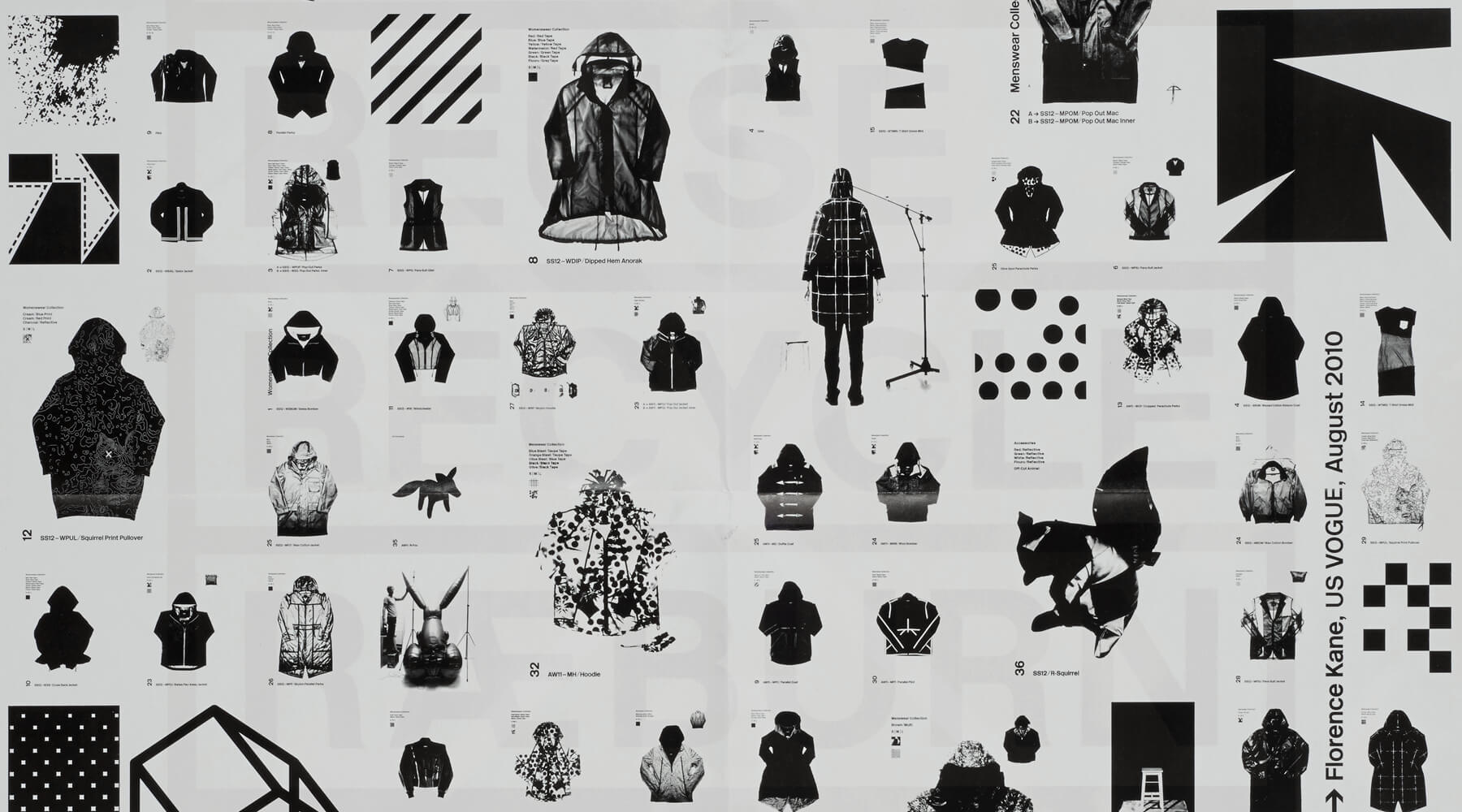
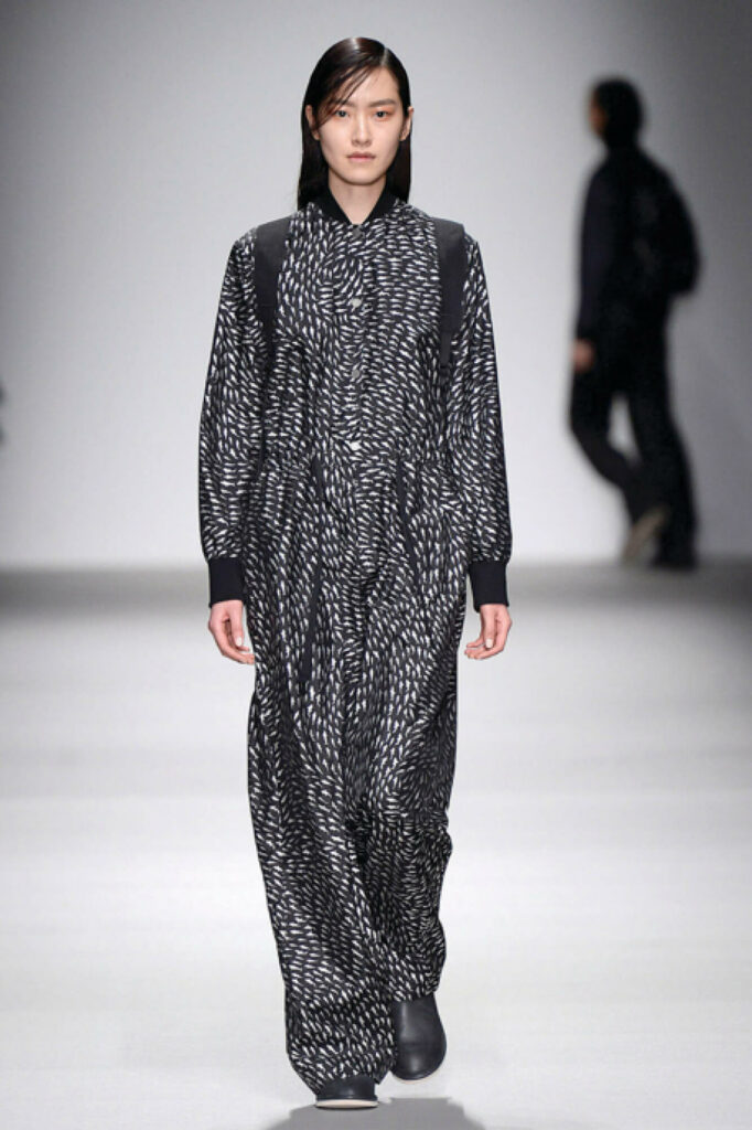
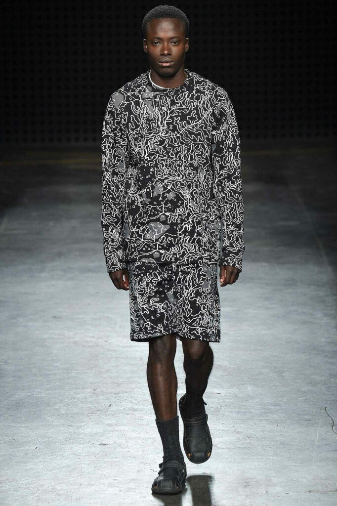
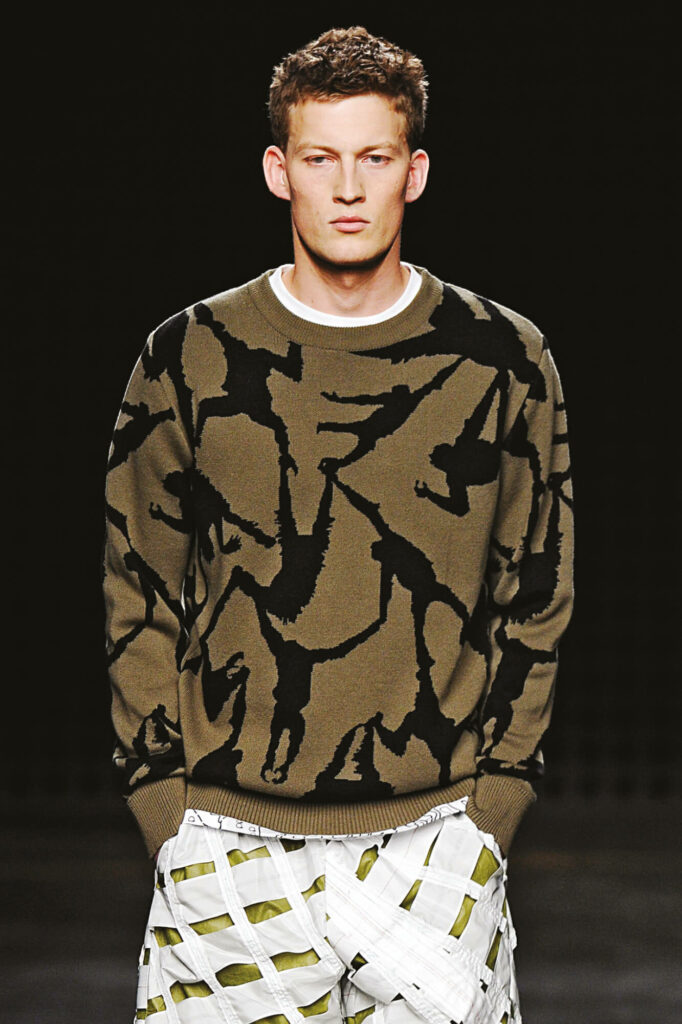
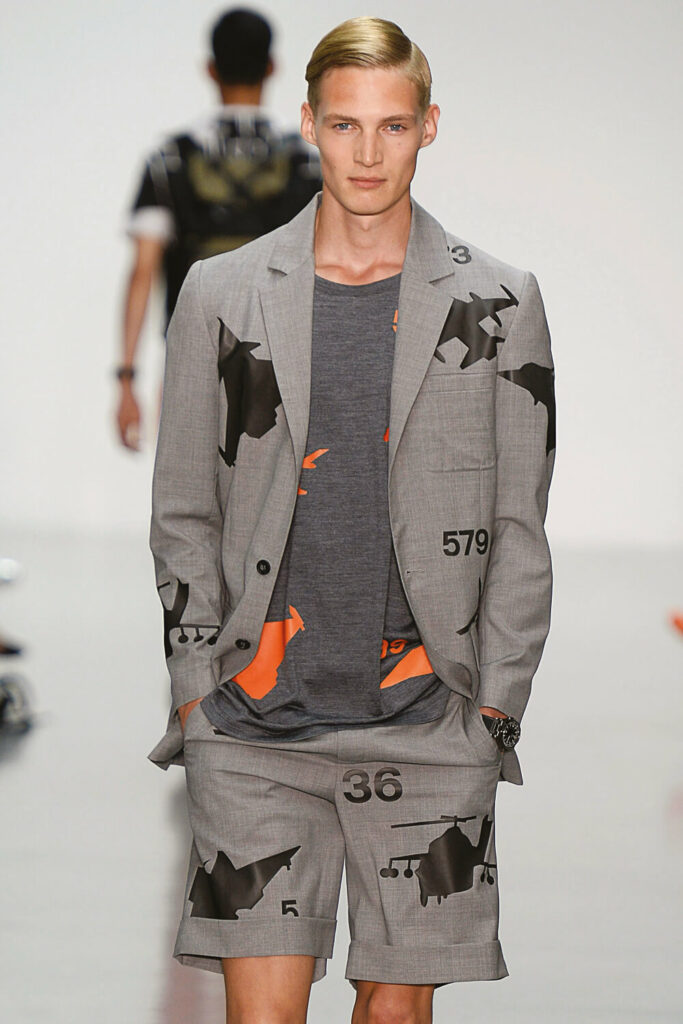
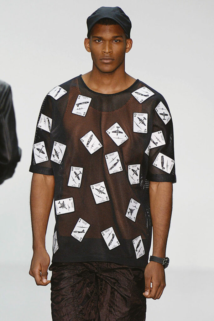
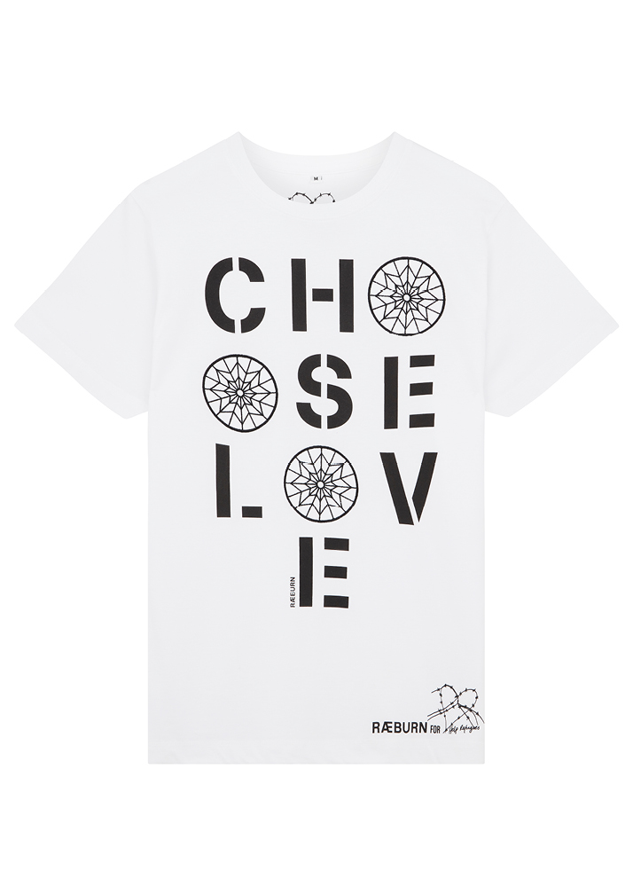
Christopher RÆBURN is a pioneer of combining sustainability, function and ethics in his fashion. By developing the general image of the brand, art directing its films and campaigns, including lookbooks and prints, we were able to echo the vision of the brand through a contemporary twist to the sustainable fashion world.
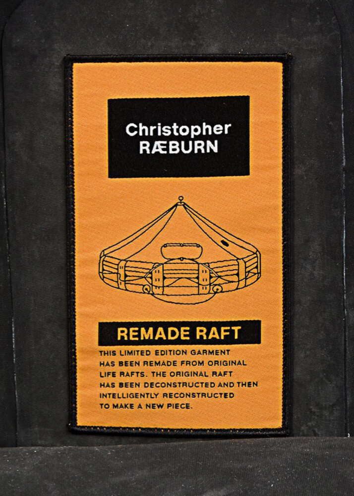
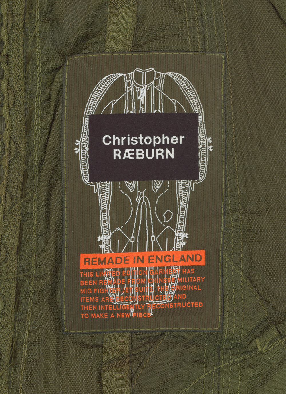
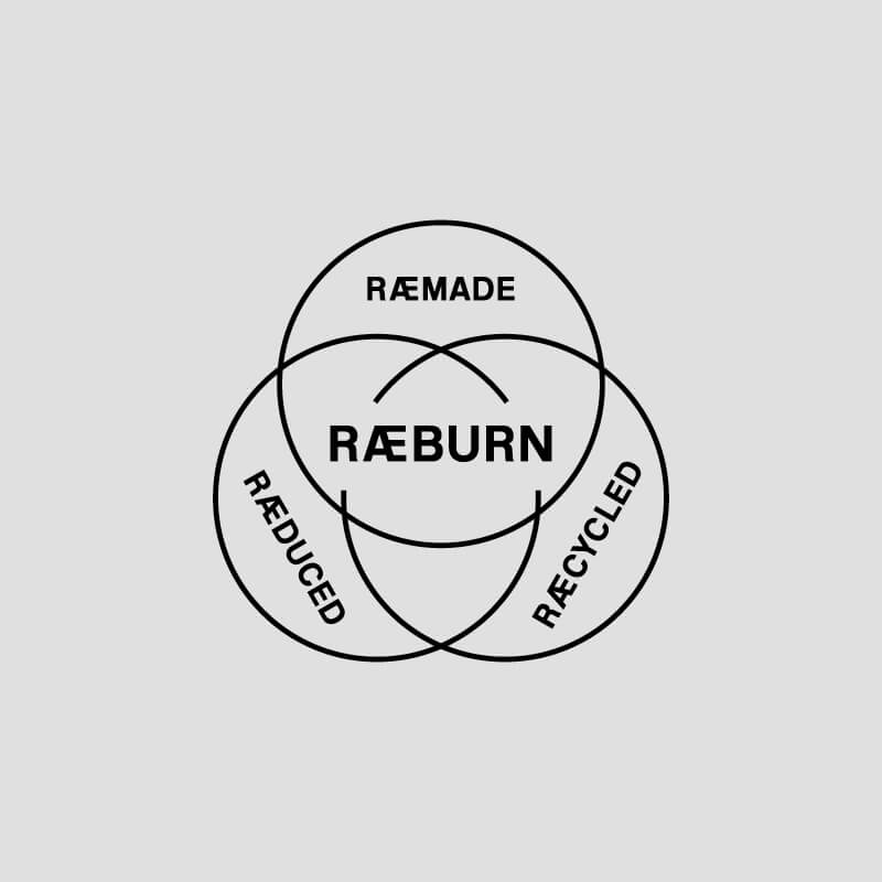
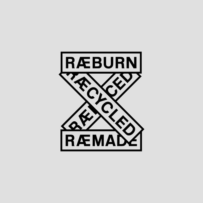
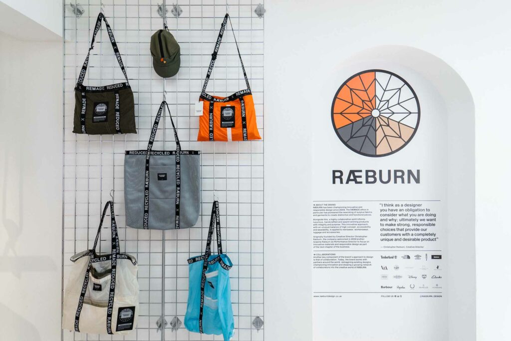
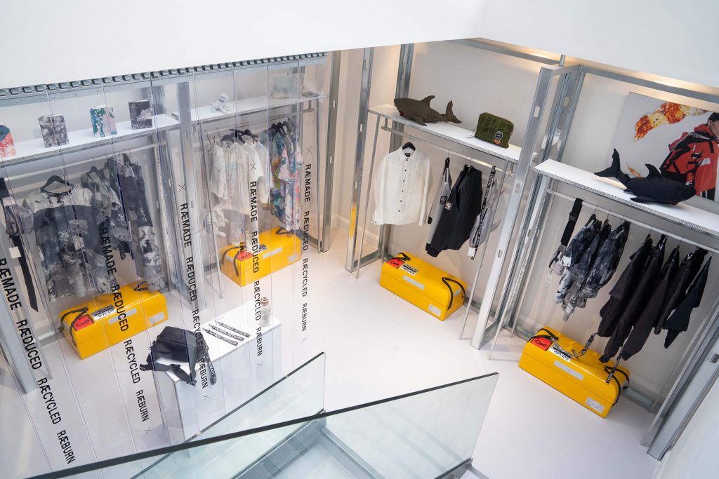
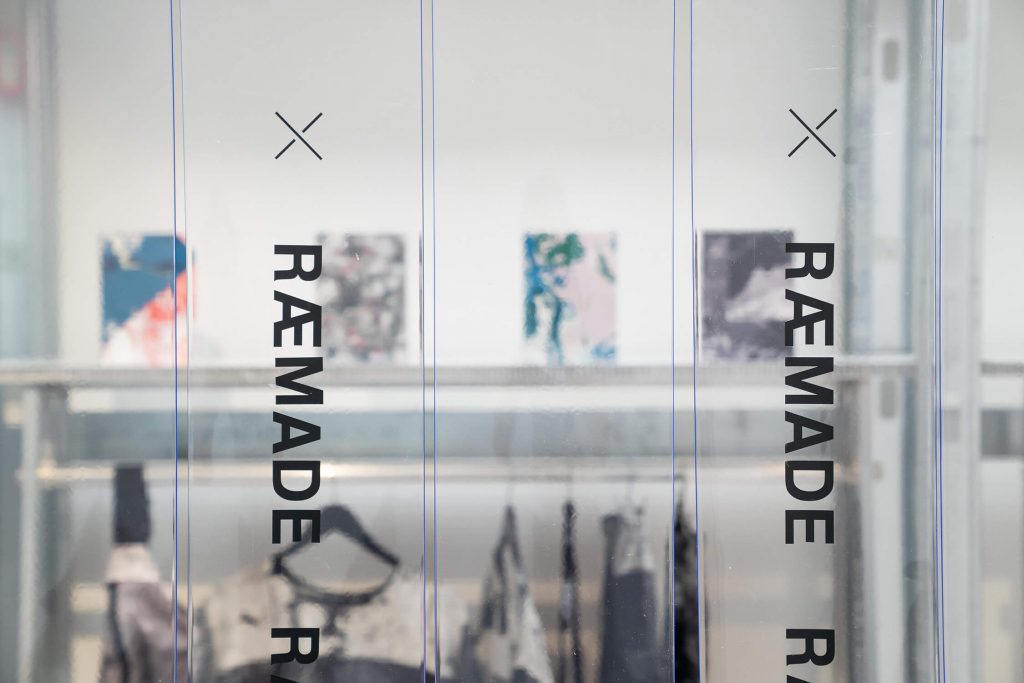
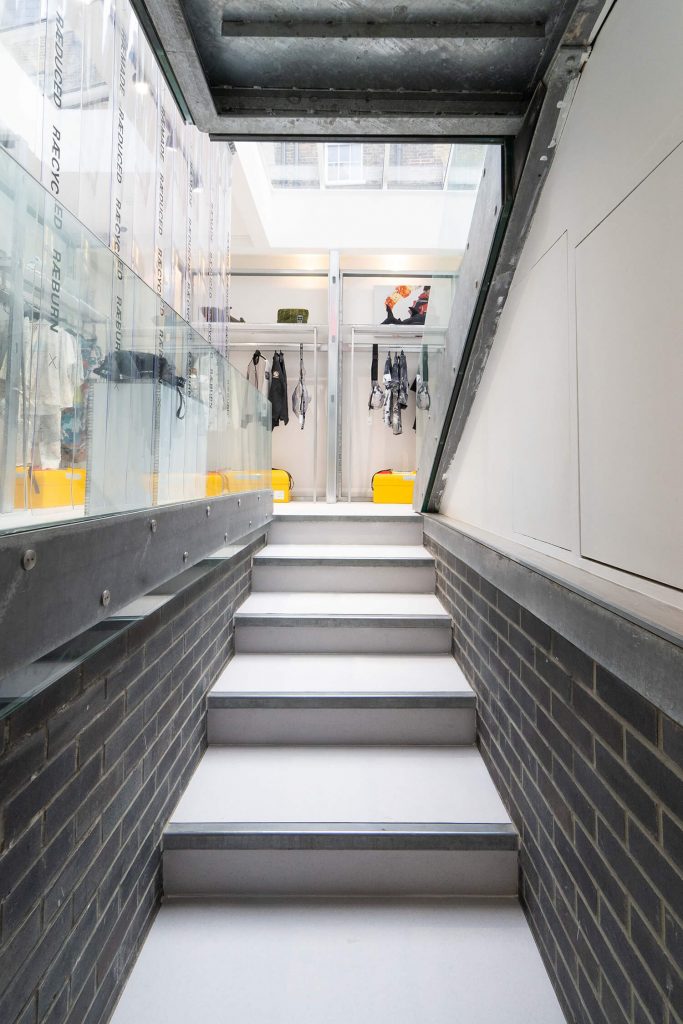
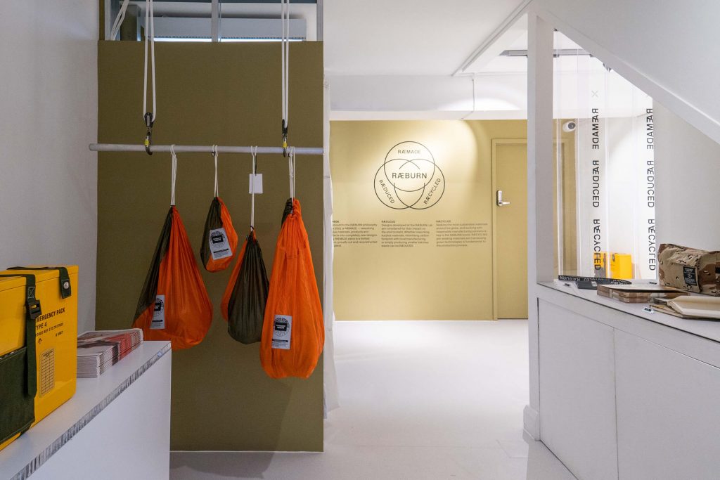
The four ‘R’s – ‘RÆMADE, RÆUSED, RÆCYCLED, RÆBURN’ – created as a brand ethos, form its manifesto for every creation to every execution, and always with an eye on sustainability.
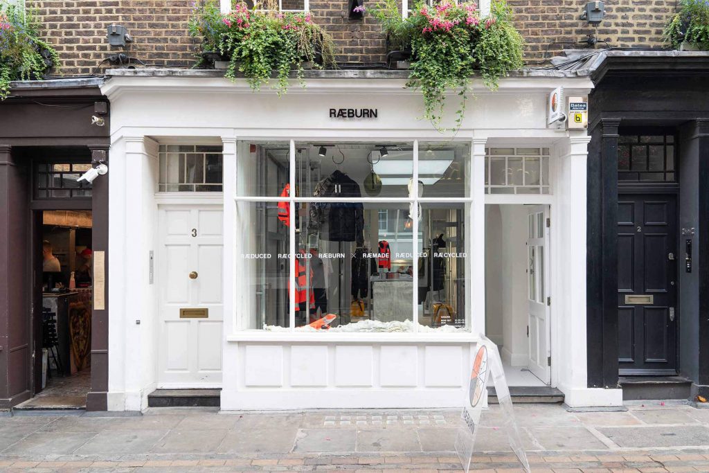
London, 2011–present
Visual identity
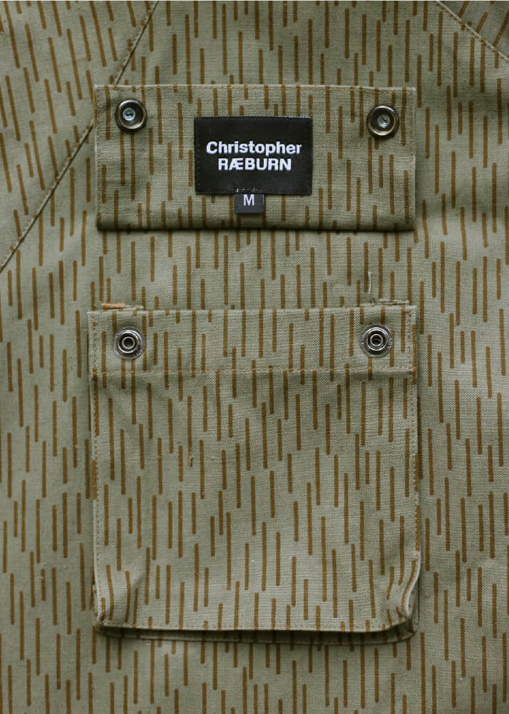
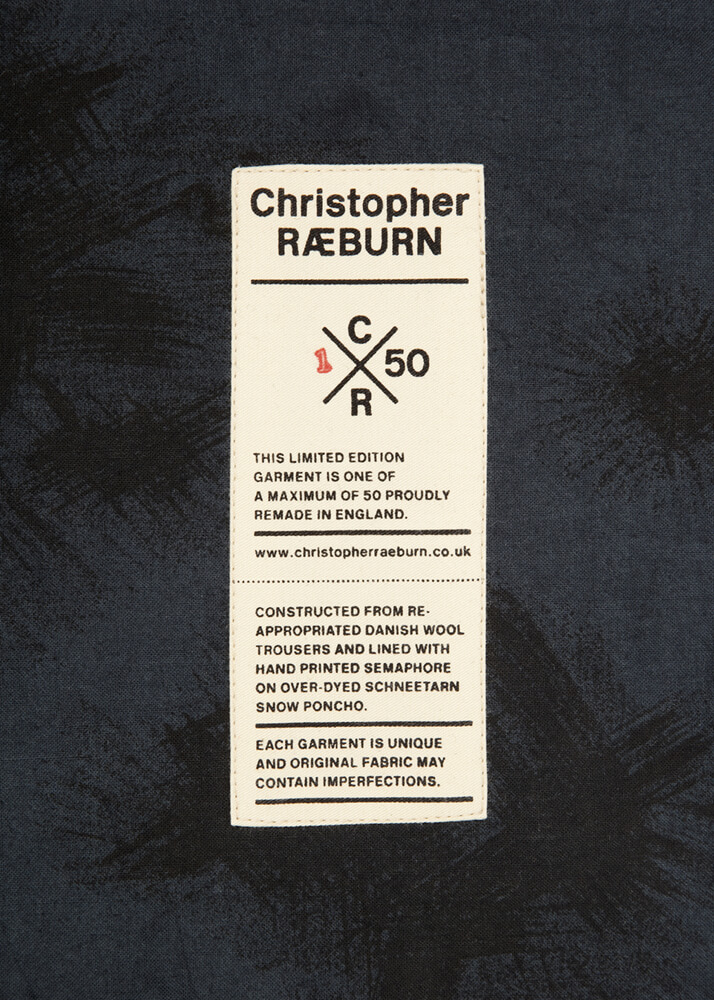
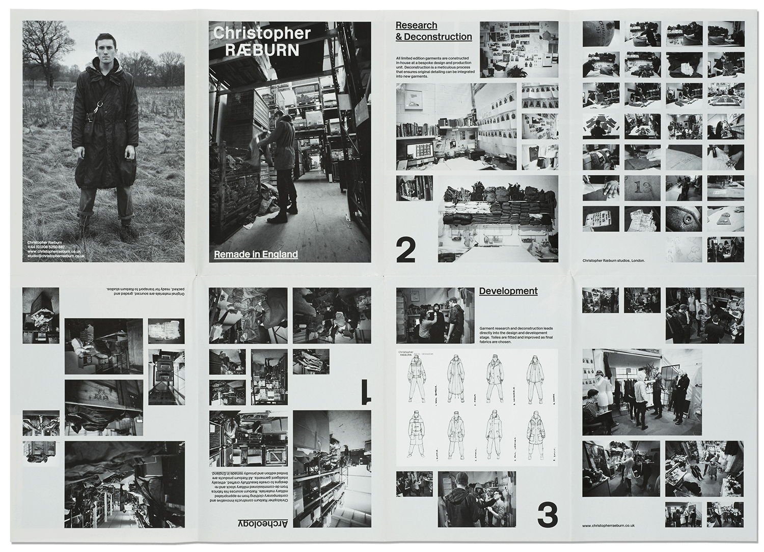
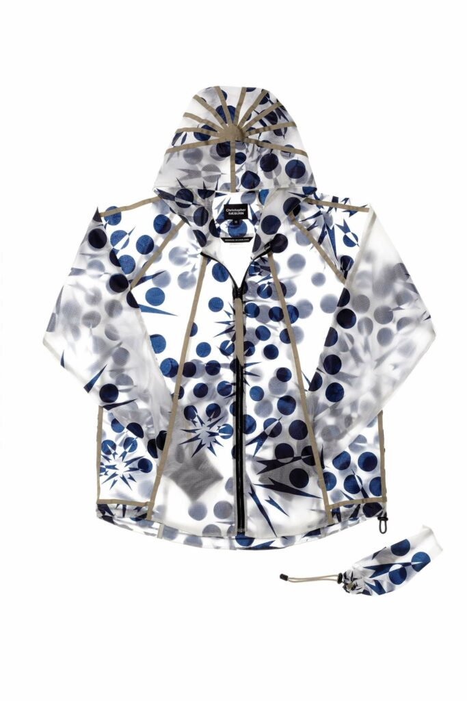
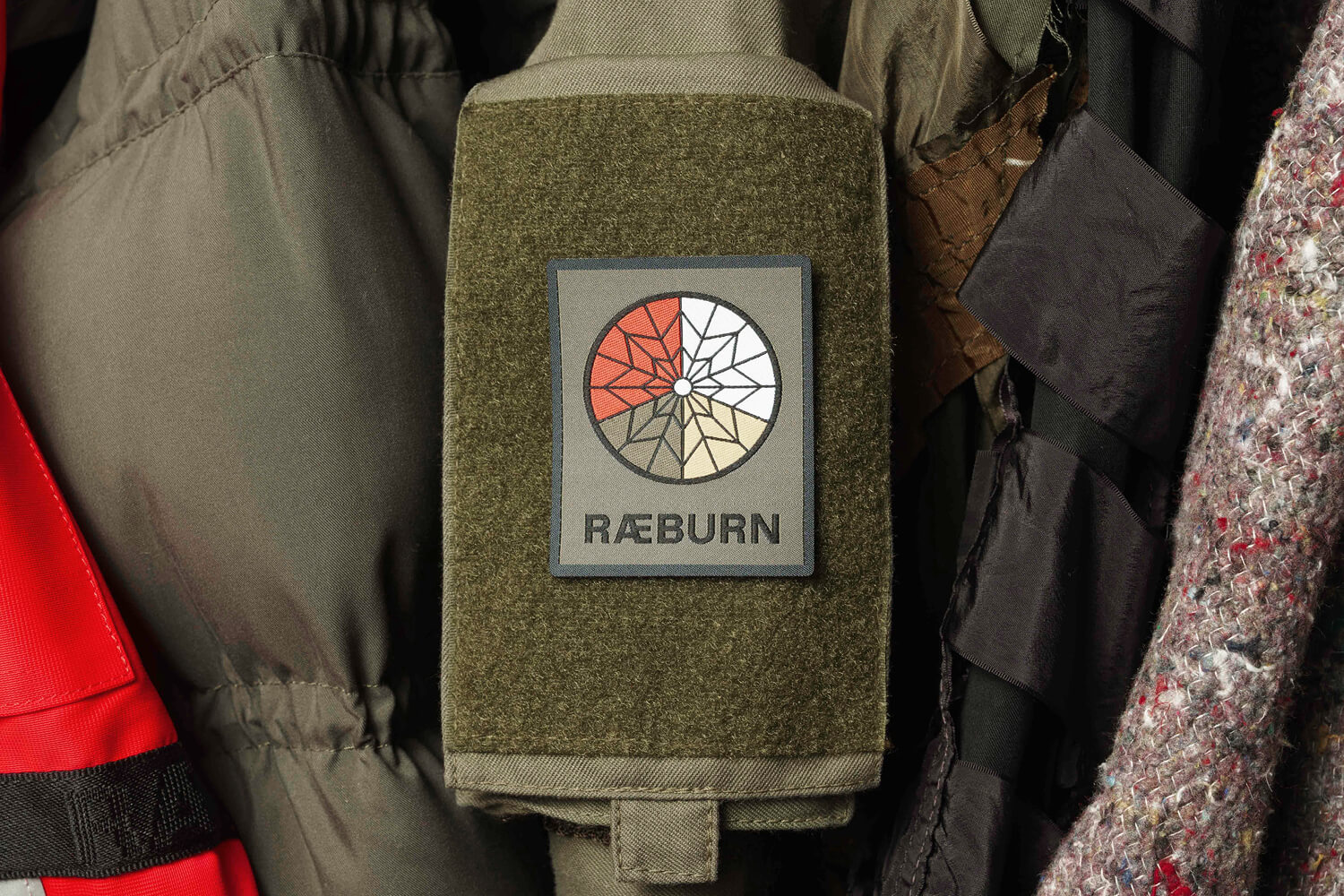
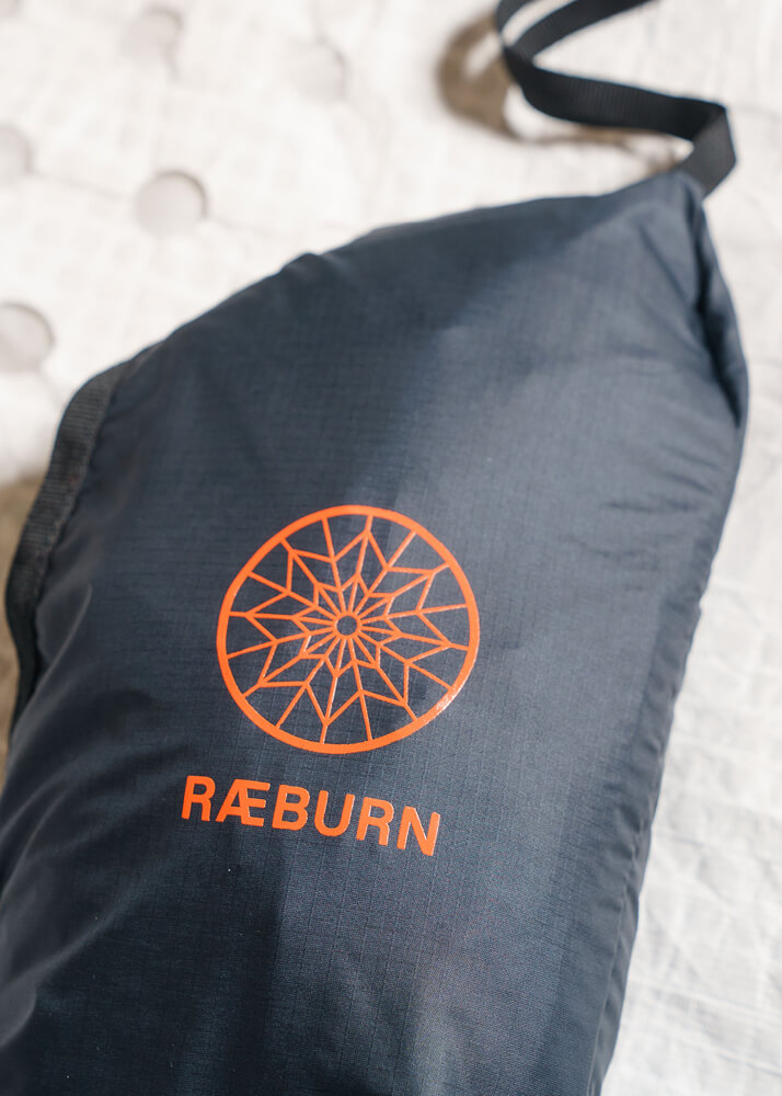
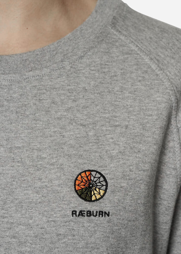
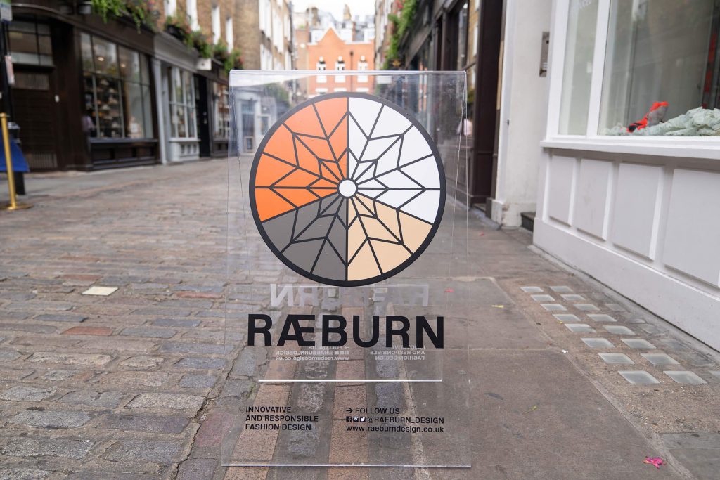
Logo rebranding and symbol for RÆBURN. Iconic, graphic interpretation of a C-9 28’ parachute used by air forces globally and unique for their colour blocked construction. White, olive and sand hues allow for camouflage whilst fluro orange allows for signalling and detection.
Photos: Sam Scott-Hunter, Ben Broomfield, catwalking.com
www.reaburndesign.co.uk